
As you may be able to guess, the Tumblr account WTF Charts is one that collects a variety of poorly assembled data visualizations. I’ve collected a few of my favorite bad examples and listed them below.
An Error in Graphics

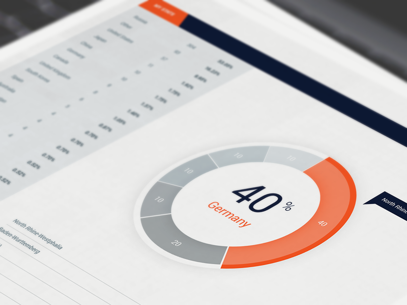
This visualization is one that has more than an issue or two. From the looks of it, someone who wasn’t exactly sure of what they were doing created it. Right off the bat, you can see that the white center of each chart is, well, not in the center. Rather, it moves to a different spot on each graphic. It appears that the designer was going for the look of a donut chart. I’ve added a photo of a standard donut chart below for reference. You can see by a glance that they look quite different. Yikes.
If these had been made into more traditional looking donut charts the designer could have moved the percentages into the center of the artwork, leaving some more breathing room on the artboard (as seen above). For me, enough white space is always a plus and means better readability.
Another chart characteristic that was used better in this second example is color. By using grey you have a sense of which piece of data the chart is trying to promote over all else. In this case, it is the bright coral segment, which represents Germany. Since the grey contrasts less with the white background, you naturally understand that everything in greyscale is “background information” (Berinato, 2019). On the other hand, in our first example, the designer used two shades of purple. This might make an onlooker have to do a double take to figure out which portion of the graph they should be paying attention to.
The issue with having such a noticeable graphical error, as seen in the first chart, is that it makes the reader question the validity of the chart altogether and in turn its source. If the artwork is not accurate does that mean that the numbers are also flawed? Can I trust this source moving forward?
An Error in Data

Here we see an in-your-face example of what absolutely terrible proportions look like. As you can observe, according to the chart above, Aaron Judge’s $622K salary is the same as Khris Davis’s $10.5M salary. Not only that, but Giancarlo’s $25M is comparable to Kris’s $10.5M.
I can easily explain what happened when this designer created this data visualization. Simply, they got lazy. My hypothesis is that once they realized there would not be enough room (or there would be too much room) for their typography on certain bars things went downhill. Instead of re-working the artwork to fit the data, they reworked the data to fit the artwork. A big “no”. If you were to take the numbers away from this chart a completely different story would be told than reality.
I found the bar graph below doing a simple Google image search. It’s a blank stock vector right now, but I thought the layout offered a good solution for this particular scenario. Here, the titles of each category cannot obstruct or influence the size of the bar in any way. Yet, this design still offers a more unique twist on a bar graph, which keeps it more interesting to look at in general.

Something that can be utilized better in both of these bar charts is the use of color. The second graph almost gets it, but the gradient of yellow to red should correspond with the percentages. The higher the number the redder the bar or vice versa.
When talking about the MLB Salary visualization, in particular, I would have loved to have seen color used as a measuring tool here. By using a scale of gradient color you can visually decipher whose salary was the highest or lowest.
Too Much Going On

Aside from the above pie chart having a very outdated appearance in general, there are other factors that make it quite unsuccessful. The fact that there is so much going on brings the success level down quite a bit. Pie charts should be left pretty simple and are most effective when they only have two-to-four segments; one of them being considerably dominant (Berinato, 2019).
The upper left of this pie chart has so many slivers that I cannot even count them. Trying to decipher each with their label even causes strain on your eyes. The white area of the chart is the outcome of the computer not being able to output such small sectors. Which obviously causes readability issues for any onlooker.
When you move your eyes away from the pie chart itself and direct them to the labels connected to each piece of the pie you can see that multiple category descriptions are 1% or even less of the chart. Since these numbers are so low, I think that an “Other” category may have been useful in lieu of all of the separates. You could always add a description of “Other” on the outskirts of the chart to keep all the specifics of the data present.
Lastly, I notice that many of the colors in this chart are repeated. This is something unexplained on the visual. Is it for reason or is it flawed? According to the legend the color yellow represents “Smart Home – Lights.” However, you can clearly see at least three sectors of yellow on the one chart. Combing all of those instances together would help with the readability and accuracy of the visual as a whole.
The example in the image below shows an example of a more legible pie chart, which combines all smaller, one-off funding sources into one slice of the pie. After going between these two pie charts, you can see what a difference a cleaner presentation makes.

