As I move forward in my quest to create a successful platform for sustainable fashion, I recently completed a series of medium-res prototype screens for the Sustainable FashHub. If you are new here, check out my last three blogs to catch up (But First, User Research; Turning Research Into Architecture; Wireframing the FashHub)! Not only was a new prototype prepared, but some user testing was completed. With the follow-through of these tasks came a lot of learned lessons. Read on to see what I took away from this past week’s experiences and why these steps are necessary for creating successful user experience (UX).
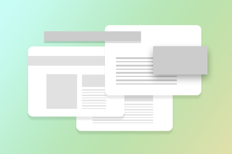
Let’s begin with prototyping. Last week I shared with you the wireframes for my Sustainable FashHub website. This week, I used those same wireframes as a base for my medium-res prototype. Already having the framework of the pages completed, I started adding branding elements to each of my art files (one art file for each of the five pages I would be prototyping). These elements included color, font, and a quick placeholder logo for the website. I took away all of the black frameworks and switched them out for white, drop-shadowed boxes in order to create a modern and airy appearance. The aesthetic of my pages ended up looking consistent with the image below.

Everything seemed to be going rather smoothly until it was time to take my files into InVision. InVision has become somewhat of an industry standard for UX designers. The software allows you to prototype and test your mobile and desktop projects before getting coded. As an InVision amateur, I was naive as to what I would really need in order to produce a prototype good enough for user testing. A five-screen prototype quickly turned into a 15-screen prototype.
I found myself having a lot of, “Oh yeah…” moments, which included:
- Asking myself how I would create the illusion of a sticky nav. I referred to this YouTube video for my answer.
- Or, trying to figure out how to make a drop-down menu appear on each page. For this, I watched this tutorial.
- I also began realizing that some tasks can be successfully completed in a few different ways. This made me think about what other pages needed to be created to accommodate this possibility.
In the end, I had this prototype to use for testing and I learned a lot about InVision in the process, a great tool to have in my back pocket. I am decently pleased with the final prototype result; however, it was hard to not want to go all out and create a screen for every last page. After all, I will be updating and refining all of the screens for the final, high-res prototype, so I needed to be careful to not take anything too far.
Moving on and gearing up for testing, I created a brief to give to my participating users. This write up included a summary of my problem statement, a short description of what the Sustainable FashHub is meant to be, and a quick explanation on how the user test will be performed; tasks included. This gave my users a little bit of background on the project so that they were slightly more familiar with what they were going into.
The three tasks to be performed were:
Task Number One: Navigate to a Sustainable Retailer blog article.
Task Number Two: Navigate to a sustainable fashion Infographic and share one to a social media outlet.
Task Number Three: Quick view the featured Jute Messenger Bag for purchase.
When deciding on which tasks I wanted to be performed by my test users, I went by a couple rules. One, each task must include multiple page clicks and two, no task can involve any of the same pages. The last thing I wanted was for the test to be too simple. Having a variation of tasks would result in a variation of feedback. In turn, this feedback would help me create a more successful website; the ultimate end goal.
After the user testing, there were a few points of potential improvement found. Some feedback was as simple as font size. A couple users wanted to see a larger font used on the shopping feature (pictured below). Sometimes user experience is just that straight-forward.

On the other end of the spectrum, I had some conversation on the organization of the navigation content and if it should be moved around a bit. Perhaps, in the next round of high-res prototypes the Fast Facts nav link will be moved under The Cause. One user commented that the two were overlapping in meaning and therefore confusing.
Overall, this week brought me a lot of new information that I can use beyond the Sustainable FashHub as well as moving forward with its completion. While prototyping sharpens software skills, user testing pushes you past your own project bias’. Next week I dive into my final high-re prototypes for the Sustainable FashHub feeling confident in the prospective outcome.
