Behind each new website is a set of wireframes. This past week was the week that I began working on the wireframes for my Sustainable FashHub website.
For anyone who does not know, wireframes are basic structural designs that help designers determine how the functionality of their future website will work. It’s a process done early on in the web-creation game and no major graphic elements come into play at this stage. Since wireframes are the bare bones of a website, they make it extremely easy to switch things around if you find yourself questioning part of your design. Wireframes are a great tool for evolving your initial layout.
For me, I was very excited to start mapping out the Sustainable FashHub. Making wireframes is something I find a lot of pleasure in. I love getting to finally develop visuals for ideas and seeing them neatly organized on an artboard.
So how did I decide which screens I wanted to wireframe? This was relatively easy to figure out. My main goal was to choose five different pages that would have completely different uses, and consequently, different layouts. The last thing I wanted was a prototype of five parallel pages.
As I mentioned in my previous blog, I landed on the following:
- Home page
- About page
- Fast Facts page
- How to Buy Sustainable page
- Shop Now page
Content
Once I knew what I needed to wireframe I had to start thinking more critically. What do I want users to do once they get to a certain page? What kind of content should be present? What will keep users clicking? How does layout affect all of the above?
For each page that I wireframed, I went back to these questions to ensure I created something that people would want.
Home – The Home page was, of course, the most intensive to plan. I knew I had to include an array of information that would keep users interested, so a slew of blog links were chosen to be incorporated. The home page blogs will display a variety of topics that are to be covered by the Sustainable FashHub. These articles will appear in chronological order. Along with the new, will be additional blog links for slightly older articles. This is a chance for users to catch what they may have missed.
I wanted to incorporate something aside from blog posts to show some variety on the site. For this reason, I placed a ‘Partner Spotlight’ near the bottom of the home page. This offers readers an option to bounce around the website to our Partners page while learning more about the sustainable community.
About – About pages can be pretty straight-forward and I did not intend this one to stray too much from the norm. I wanted to keep the content minimal to not take away from the integrity of the site’s mission. Content will be kept to the Sustainable FashHub bio, an image, and a couple of blog links to allow for click-throughs.
Fast Facts – This page is one that I foresaw being similar to a media page. The thought behind the content was that users want quick data, not drawn out research. So, I planned to make Fast Facts a page of data visualizations made shareable for social. The idea is to give the Sustainable FashHub a little extra exposure while educating at the same time.
How to Buy Sustainable – Here is where a lot of content will be stored on the Sustainable FashHub. The purpose of this page is simply to give users information in the form of blogs. Similar to the homepage, How to Buy Sustainable will have a section on the newest blogs and a section for the slightly older with the option to click ‘more’ in order to see the full How to Buy Sustainable catalog. Similar pages will exist for the other specific blog topics such as The Cause and Upcycling. These pages allow users to easily navigate to the blogs that interest them the most. If you are looking for sustainable shopping advice you will go to the How to Buy Sustainable page, but if you are looking to transform your old jeans into something new you will go over to Upcycling.
Shop Now – Lastly, the Shop Now page is somewhere users can put their goals of sustainability to work, a Hub for all sustainable fashion items. Shopping is made easier by giving users a catalog of ‘What’s New’ in sustainable fashion along with a choice of shopping by section; clothing, accessories, or second-hand items.
Layout
As far as layout, I looked to the Gestalt principals for some guidance. I chose to incorporate a lot of the principals into the layout of my Sustainable FashHub wireframes because they directly affect how successful the functionality will be.
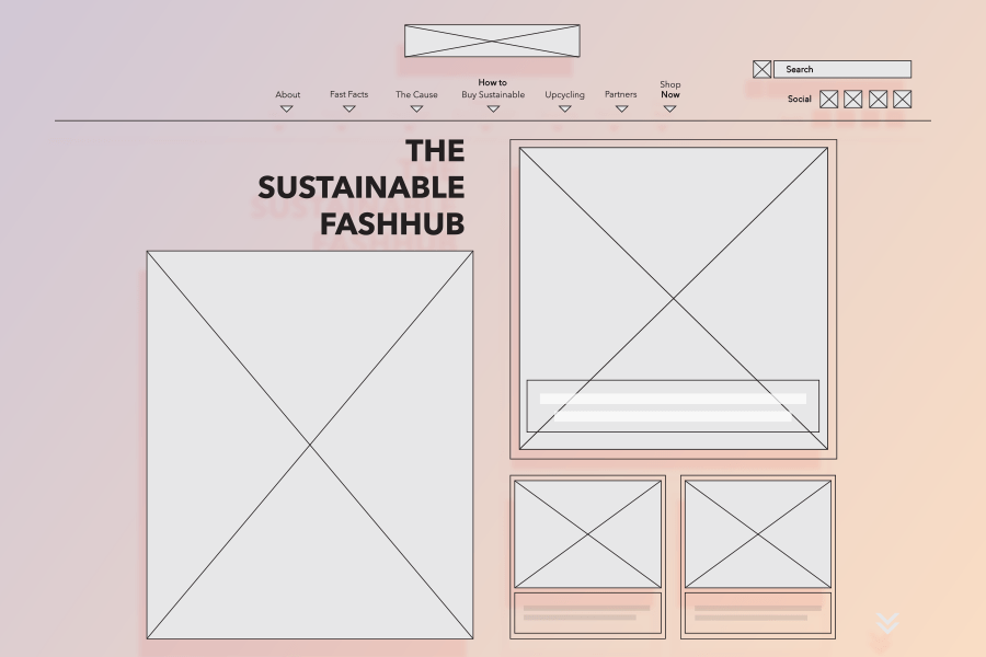
As an example, my Shop Now wireframe is pictured below. I used the following Gestalt principals to create my functionality framework:

Common fate – By incorporating the ‘What’s New’ scroller on the Shop Now page, I have incorporated the similar fate principle into its layout. The arrows suggest a rotating catalog of products. With each click of an arrow, all of the products move in unison to the left or the right.
Continuity – The same shop feature is also an example of continuity. The feature offers an endless loop of products. Even when the end of the list is reached the loop will begin again. This will keep users scrolling through items smoothly without any abrupt and disappointing end.
Common Region – The common region principle is used repetitively on this wireframe. We see it used in the sticky nav, in the shop feature, and at the bottom of the page where you can find the three different shopping segments. This helps the user understand the variance between the numerous sections that exist on any given page. Our ‘What’s New’ section does not bleed into our ‘Accessories’ section and so forth.
Closure – Lastly we have closure. At first glance, you may anticipate closure and common region being the same, but they are anything but. While the grey box behind the ‘What’s New’ shopping catalog represents a common region, the white boxes that enclose each individual item represents closure. This adds an extra level of separation and clarity for the user.
I followed a similar strategy for the rest of the wireframes, which can all be viewed here. Referring to these principles for my content layout kept the user at top of mind throughout the wireframing process.
